Interaction Labs: From DIY to Distinct
Interaction Labs: From DIY to Distinct
Interaction Labs: From DIY to Distinct
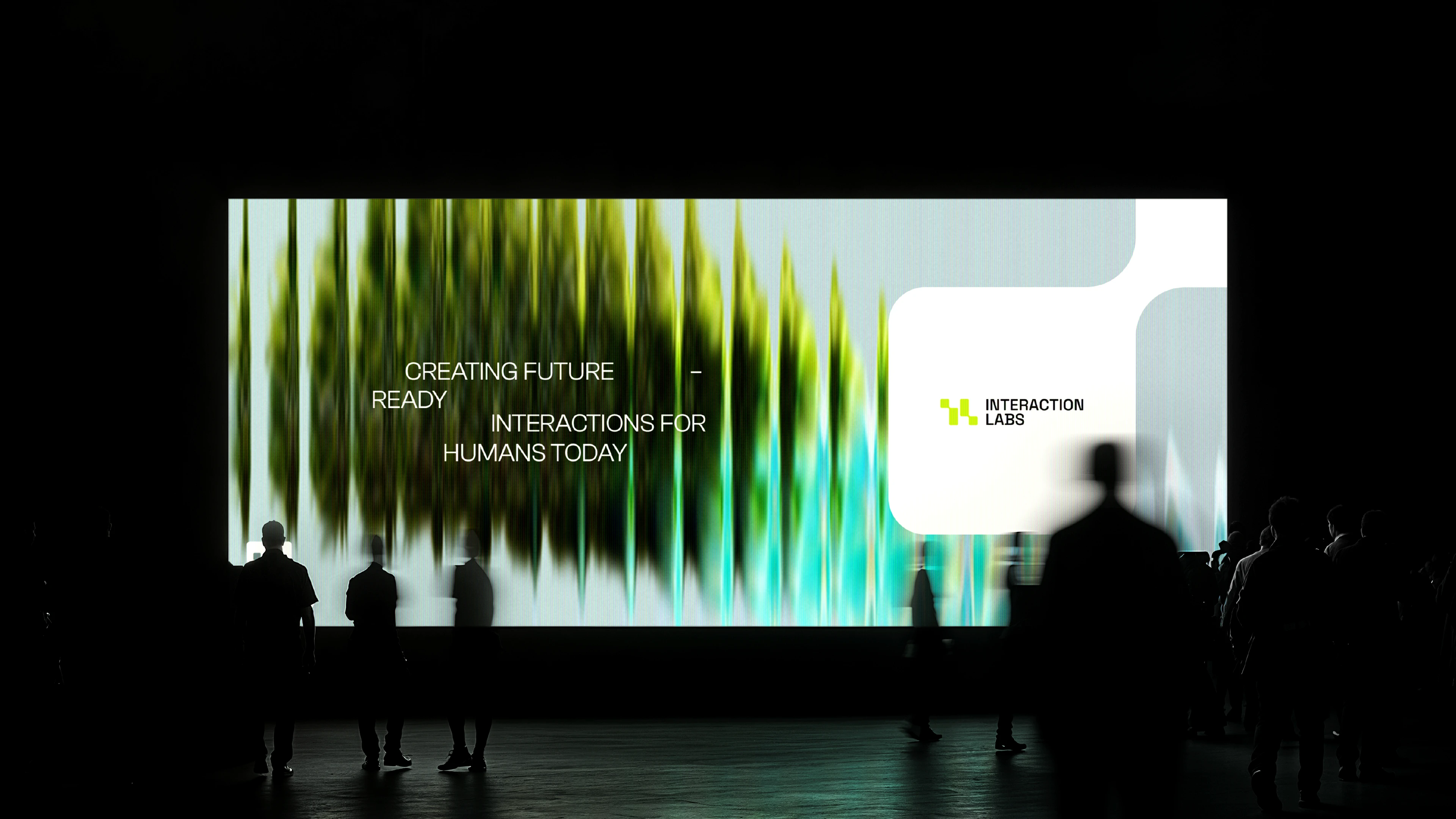
Reimagining a product studio from the ground up.
Logo & Visual identity redesign for a product engineering studio that co-creates digital products with founders & leaders through identifying market gap and building human-centric solutions to propel growth.
The result? A bold new logo and visual identity that not only captures the essence of Interaction Labs but also strengthens its presence across internal and external touchpoints. By aligning strategy with design, Oddeasy ensured that the brand’s personality isn’t just seen—it’s felt, recognized, and remembered.
Reimagining a product studio from the ground up.
Logo & Visual identity redesign for a product engineering studio that co-creates digital products with founders & leaders through identifying market gap and building human-centric solutions to propel growth.
The result? A bold new logo and visual identity that not only captures the essence of Interaction Labs but also strengthens its presence across internal and external touchpoints. By aligning strategy with design, Oddeasy ensured that the brand’s personality isn’t just seen—it’s felt, recognized, and remembered.
Reimagining a product studio from the ground up.
Logo & Visual identity redesign for a product engineering studio that co-creates digital products with founders & leaders through identifying market gap and building human-centric solutions to propel growth.
The result? A bold new logo and visual identity that not only captures the essence of Interaction Labs but also strengthens its presence across internal and external touchpoints. By aligning strategy with design, Oddeasy ensured that the brand’s personality isn’t just seen—it’s felt, recognized, and remembered.
Client:
Chirag Jobanputra
Industry:
B2B Tech
Discipline:
Rebranding
Project partner:
Potent Ventures
Services
Creative Strategy
Logo Design
Visual Identity
Landing Page & Deck
Brand Style Guide
B2B Tech
At a Glance
The Whole Journey
Setting the Course
As we began setting the course for Interaction Labs, a product engineering studio that co-creates digital products by identifying market gaps, we faced a challenge.
Despite creating large-scale platforms like Skill India Digital (an initiative by the Government of India), the brand had no structured visual identity. Their logo was DIY, and the lack of cohesion was limiting trust and scale. Chirag, the founder, came to us with a clear intent: create a visual identity that looked and felt like Interaction Labs.
Concern: The absence of a strong brand presence was limiting trust and scalability. Could a rebrand shift the perception to match their experience and ambition?
Mapping The Journey
We began where we always do - with a structured process of discovery, direction, and design.
Discovery:
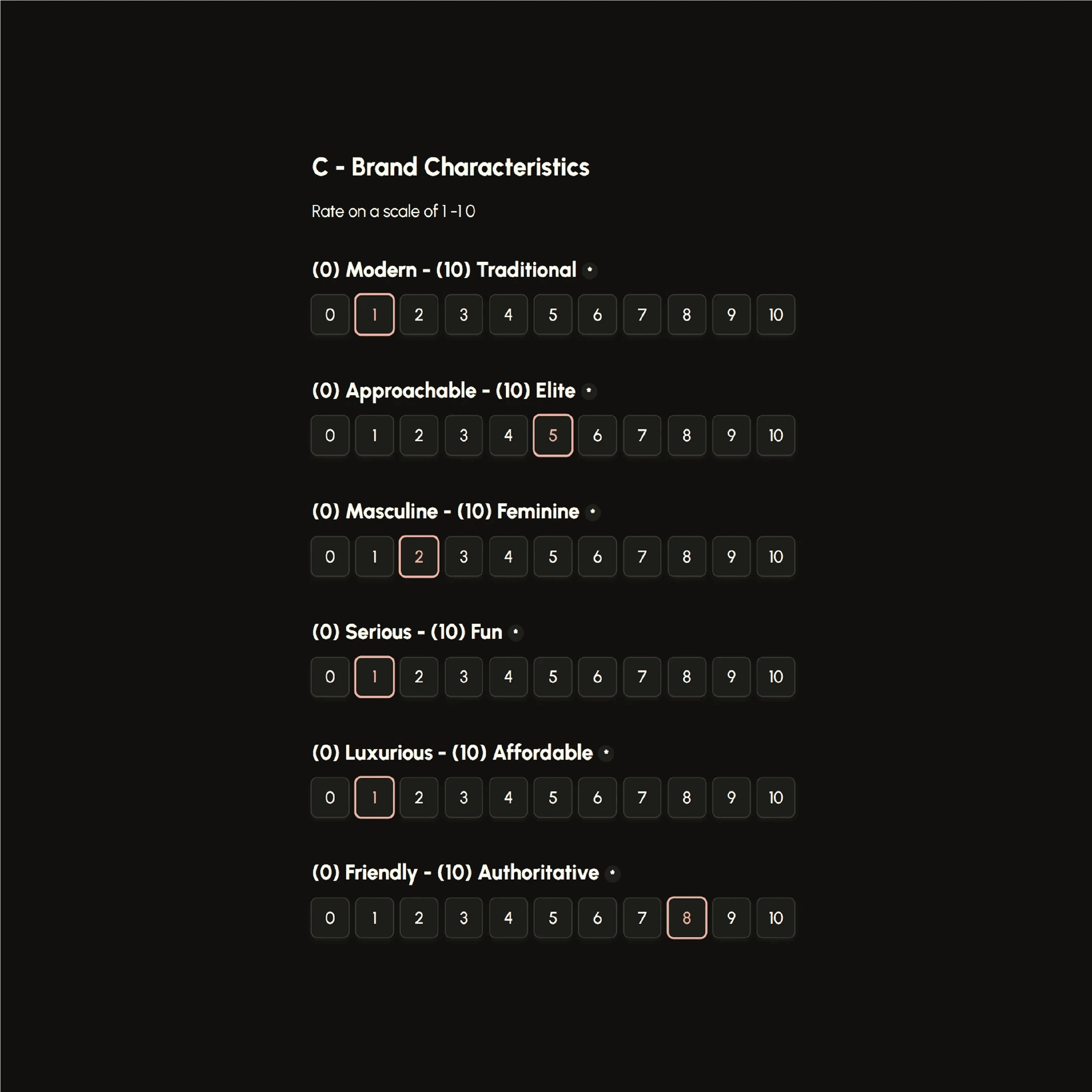
We conducted a deep dive into the brand: its customers, current perceptions, internal aspirations, and business goals.
This helped us define key variables that would go on to influence the brand’s personality and creative strategy.


Creative Strategy:
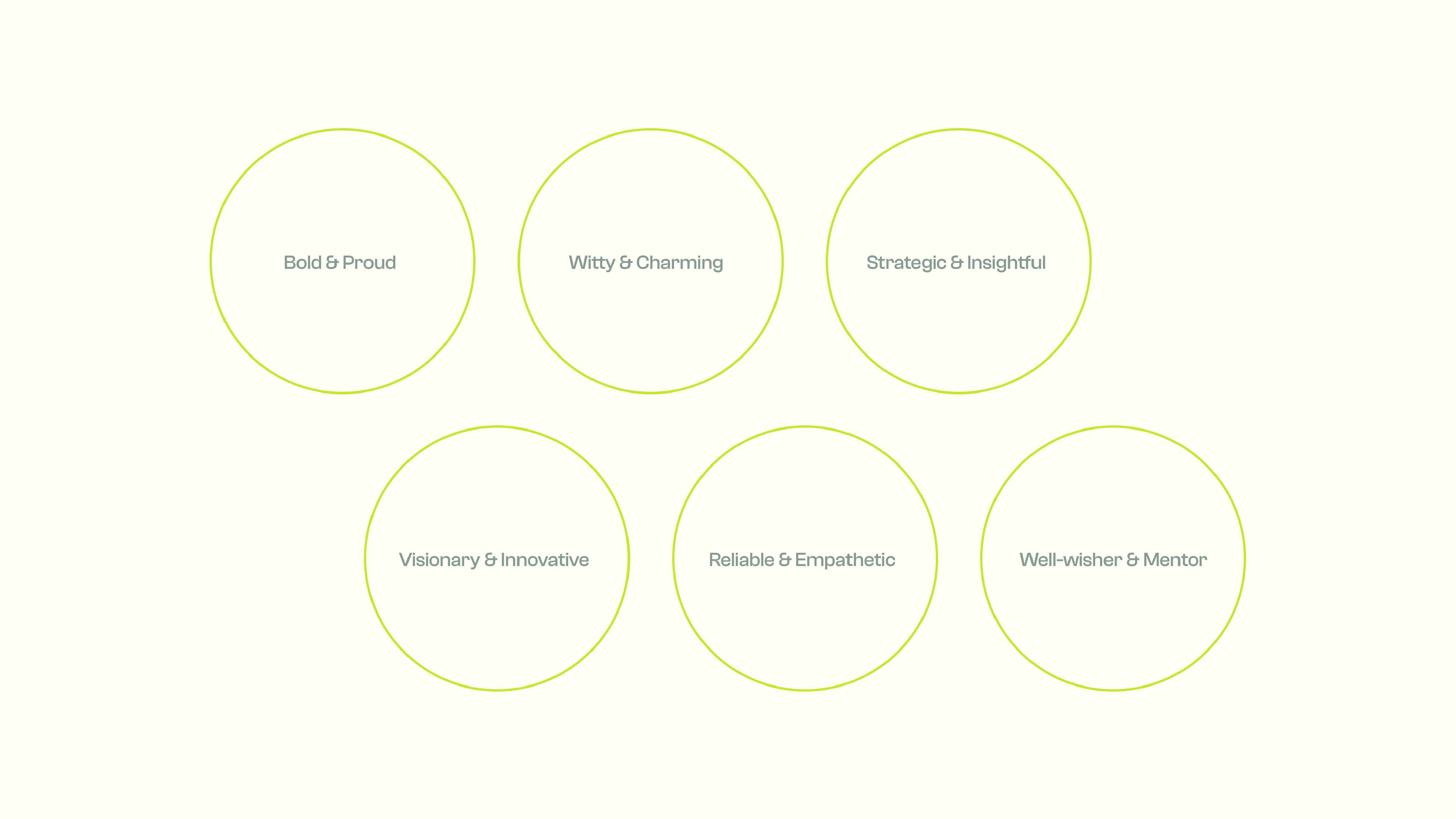
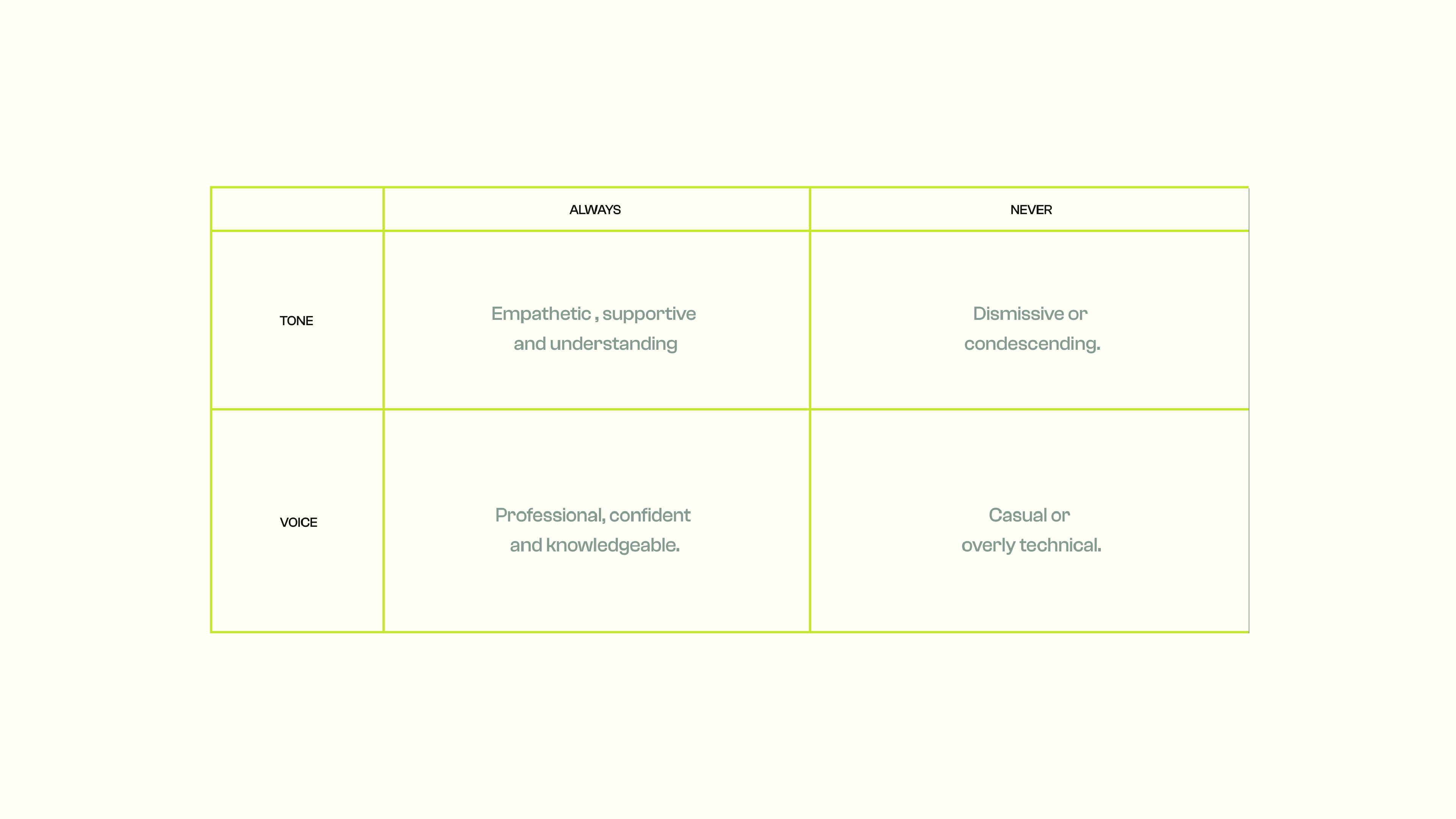
With these insights, we mapped the competitive landscape, built an ideal customer persona, and grounded the brand in a personality that reflected its core values.
For Interaction Labs, we leaned into the Sage archetype—an identity built on insight, clarity, and deep thinking.



Visual Direction:
We explored multiple creative routes in-line with both creative strategy and the founder’s preferences. Every visual choice was made in service of the brand’s newly defined core: interaction, intention, and growth.
Every visual choice was made in service of the brand’s newly defined core: interaction, intention, and growth.


Insights: What seemed like a visual design challenge turned out to be a deeper strategic problem. The brand’s perception simply didn’t reflect its depth, limiting how far it could grow.
Into the Expedition
For us, the logo is never the starting point of our journey. It is the ultimate blending of a larger story. And every story has a core concept.
At the heart of Interaction Labs, we charted their core concept - interaction between two sides. A founder and a team, a product and its user, a digital and human world. That became our guiding star.

From there, we crafted a logo after multiple iterations, and finally, one concept stood out. It was approved in the very first presentation, accompanied by a 5-minute monologue from Chirag about how seen he felt in the process. That mid-journey happiness.


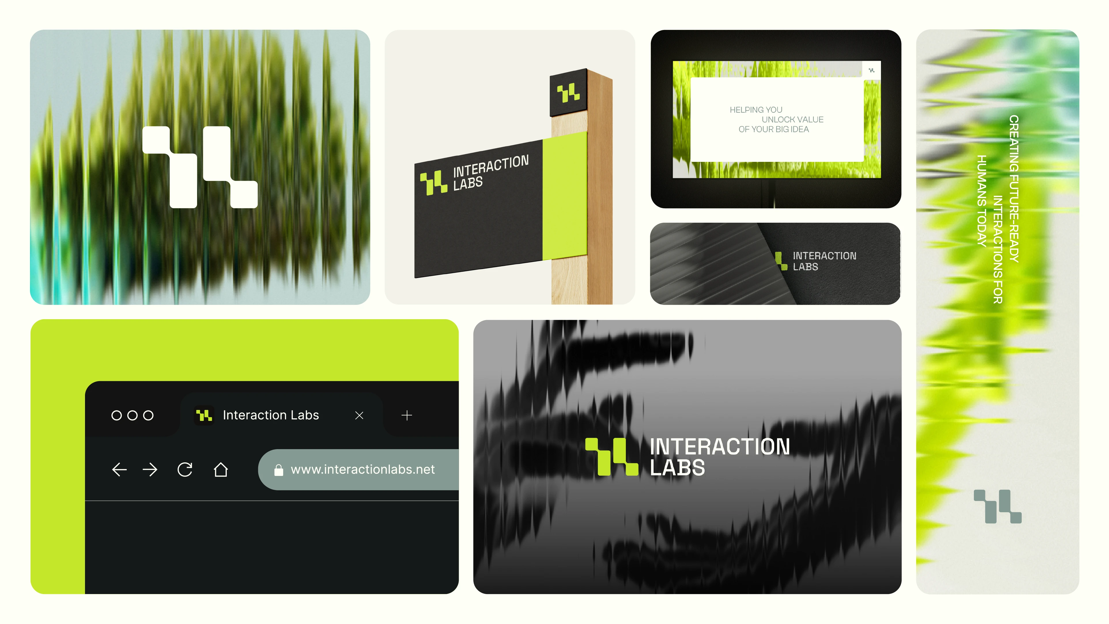

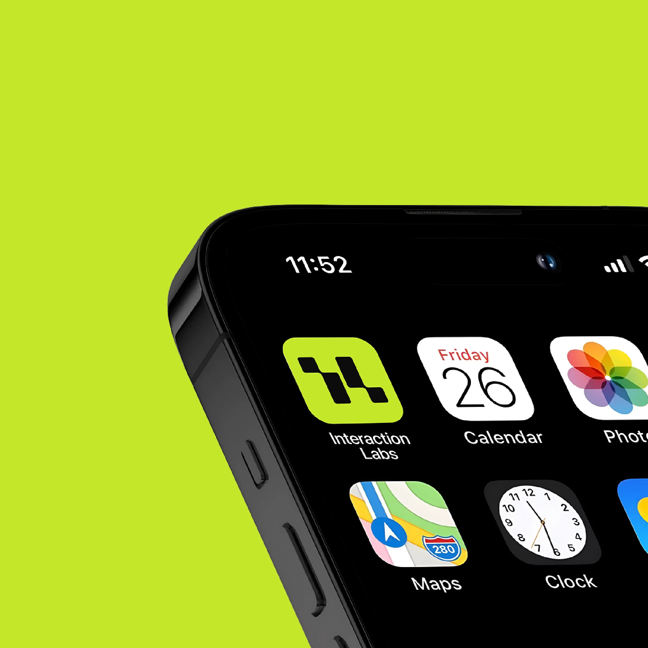
Solution: A new visual identity that would reflect Interaction Labs' values and resonate with both internal teams and potential clients. More than a facelift, this was a reframe of how the brand showed up in the world.

The Touchdown
With the core concept in place, we expanded it into a full identity system.
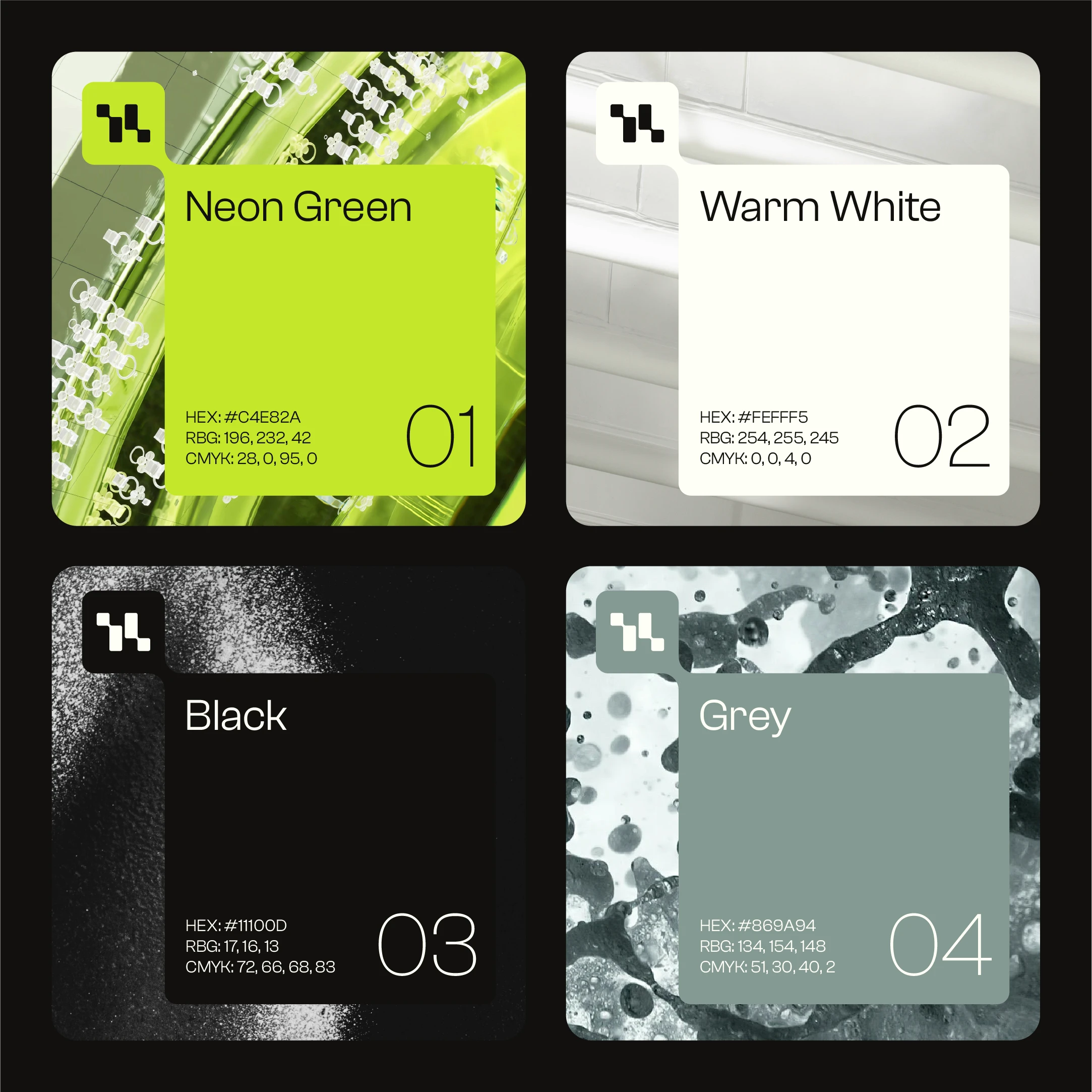


Visual Identity System:
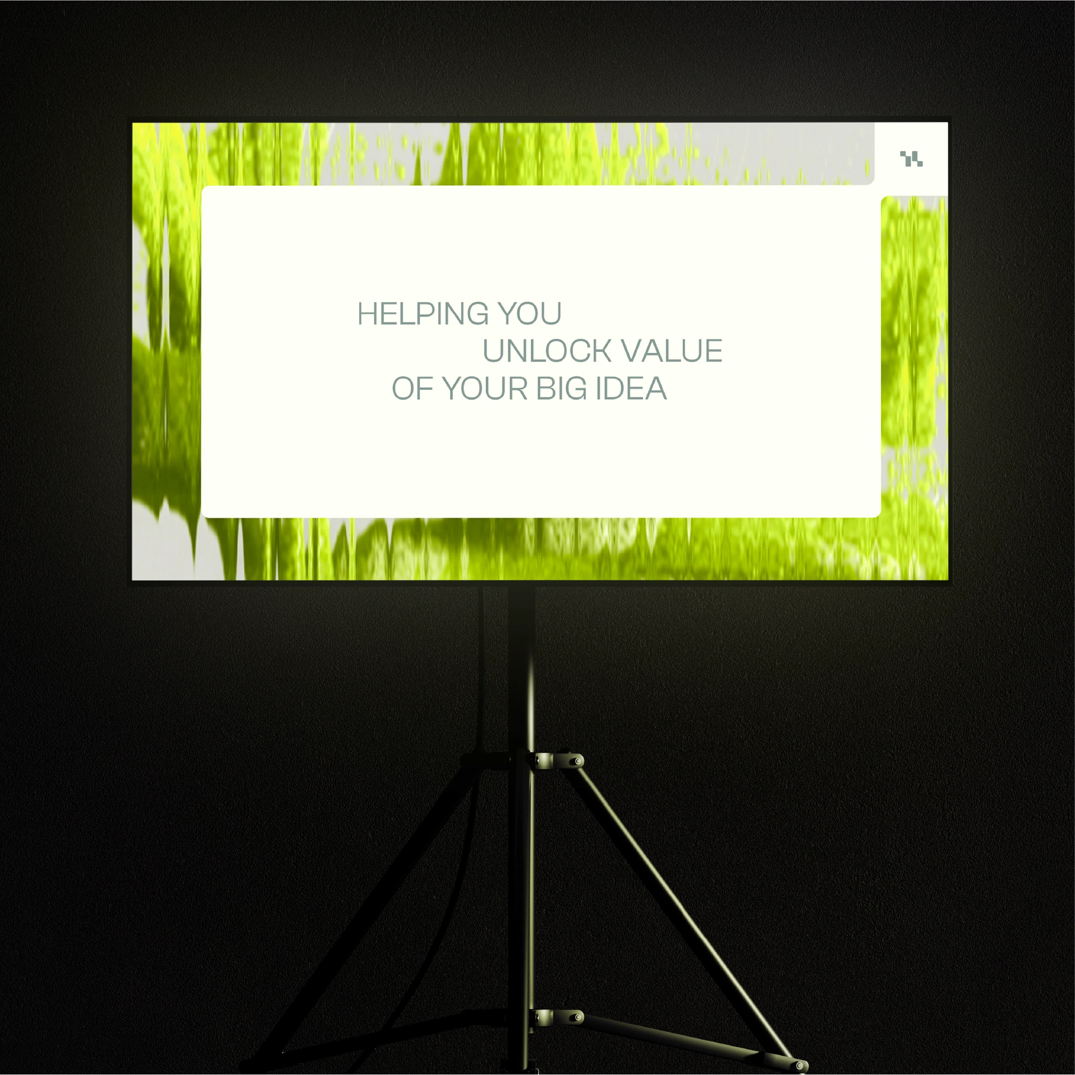
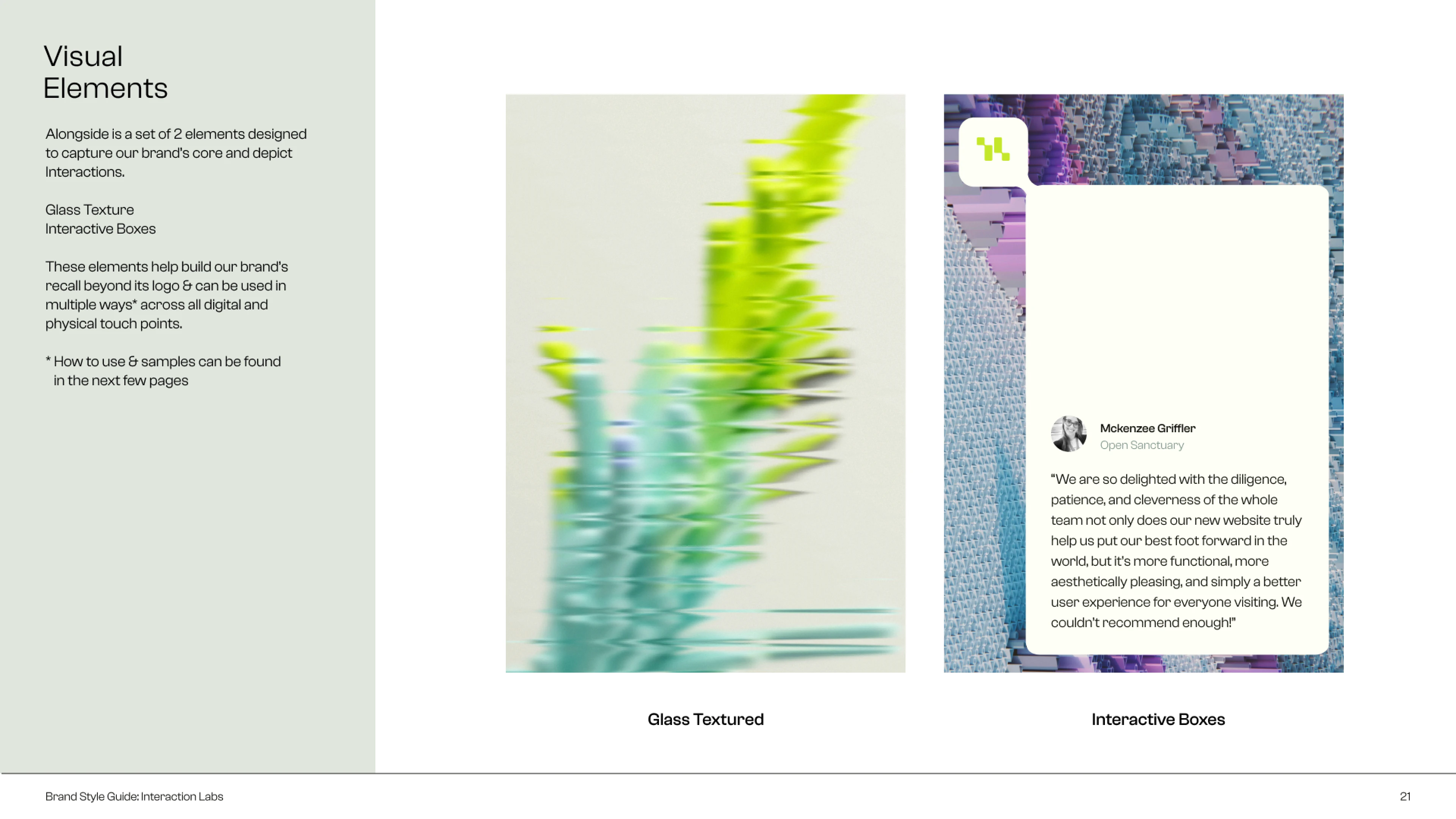
We extended the idea into a cohesive visual system, introducing “fluted glass” as a recurring design element to represent the blend of digital and organic through a human-centric lens.
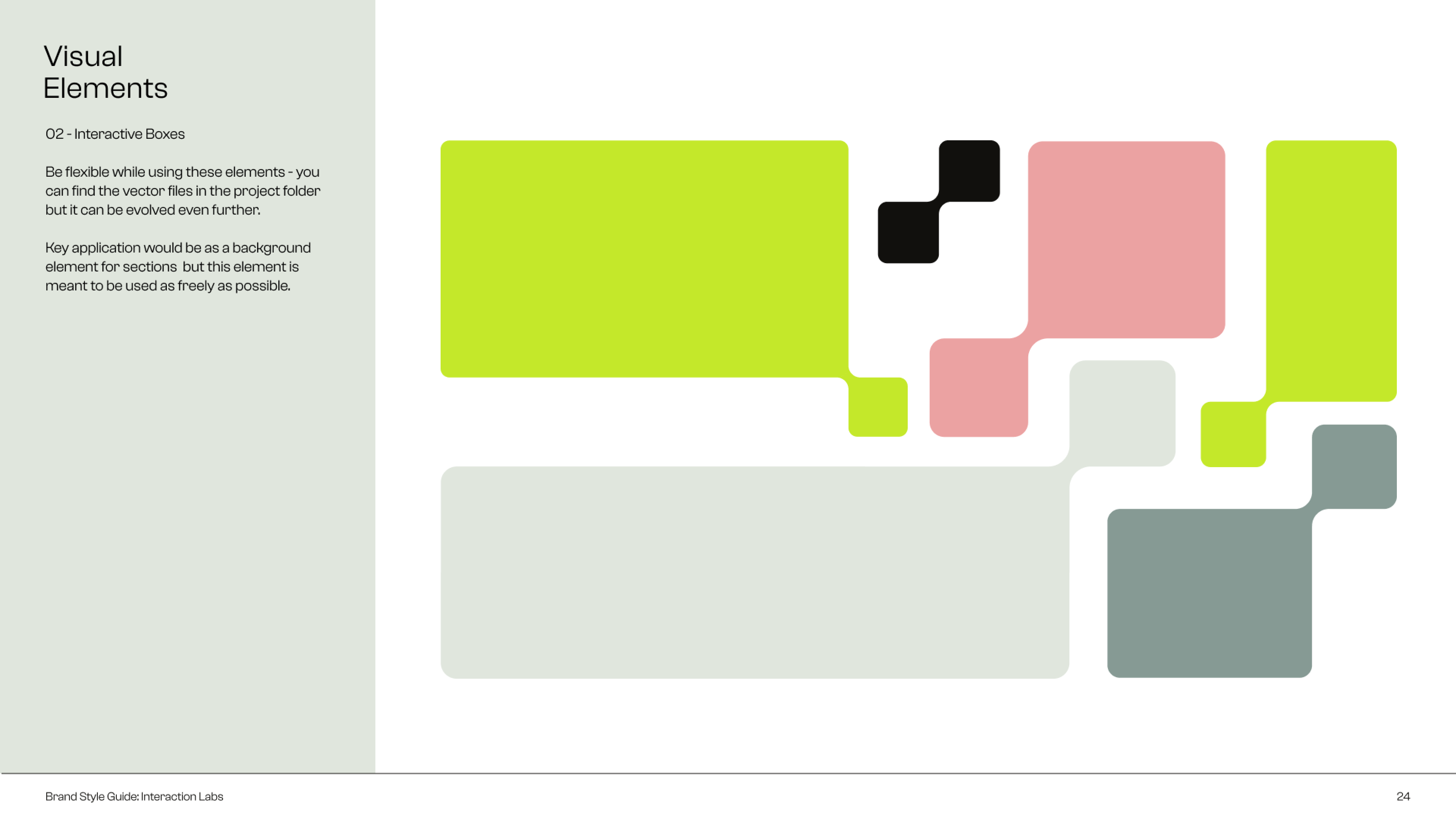
We further expanded the logo into a system based on sections interacting with each other.
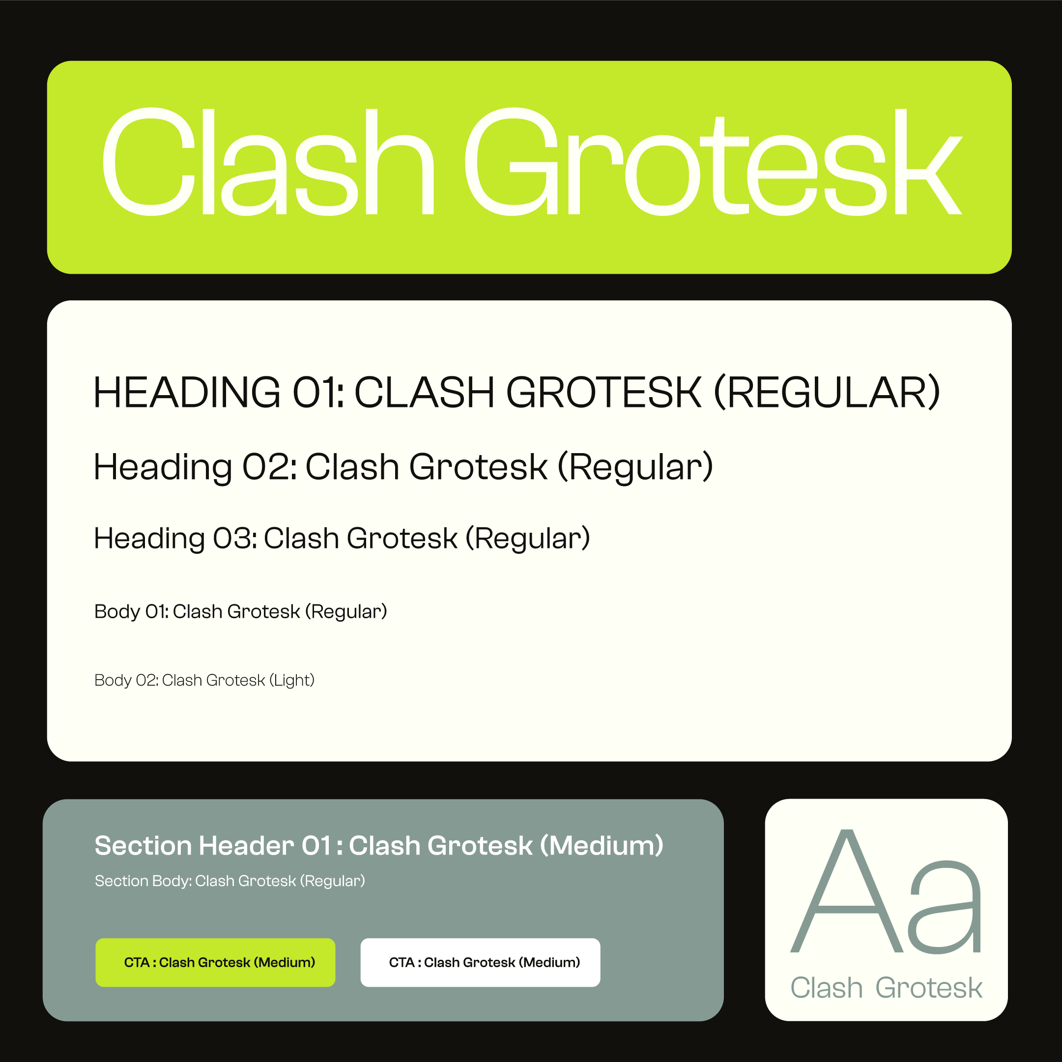
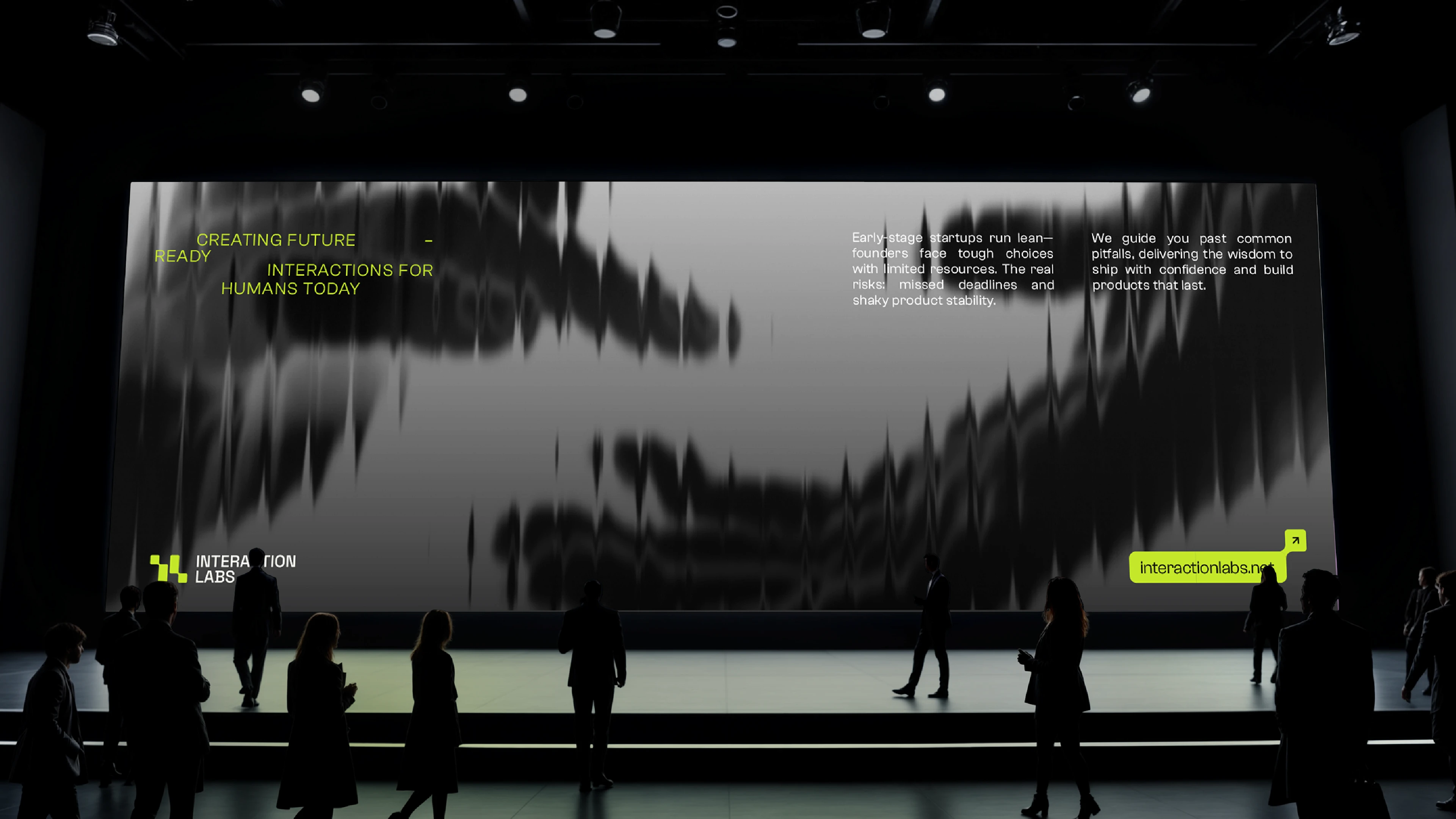


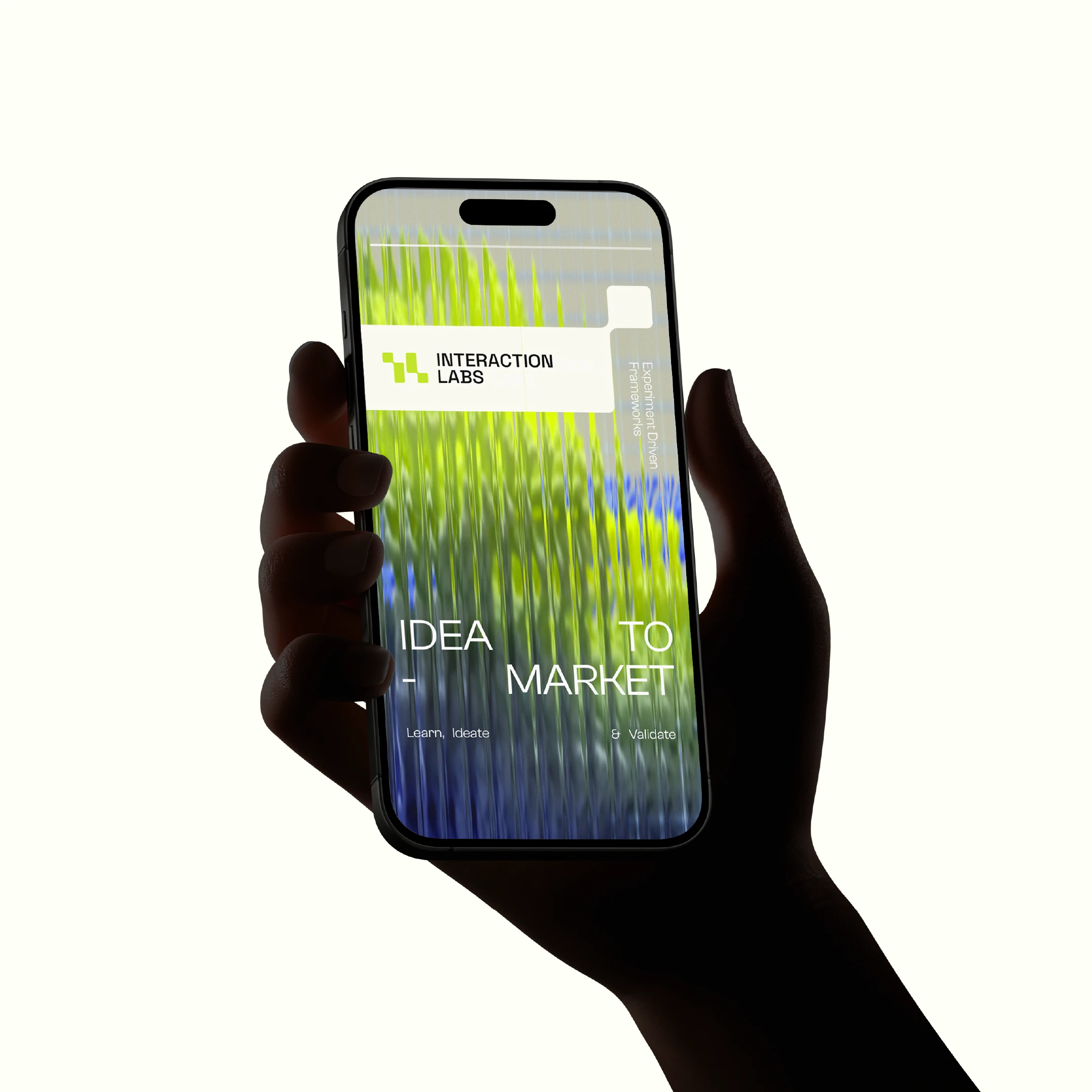
Digital Touchpoints:
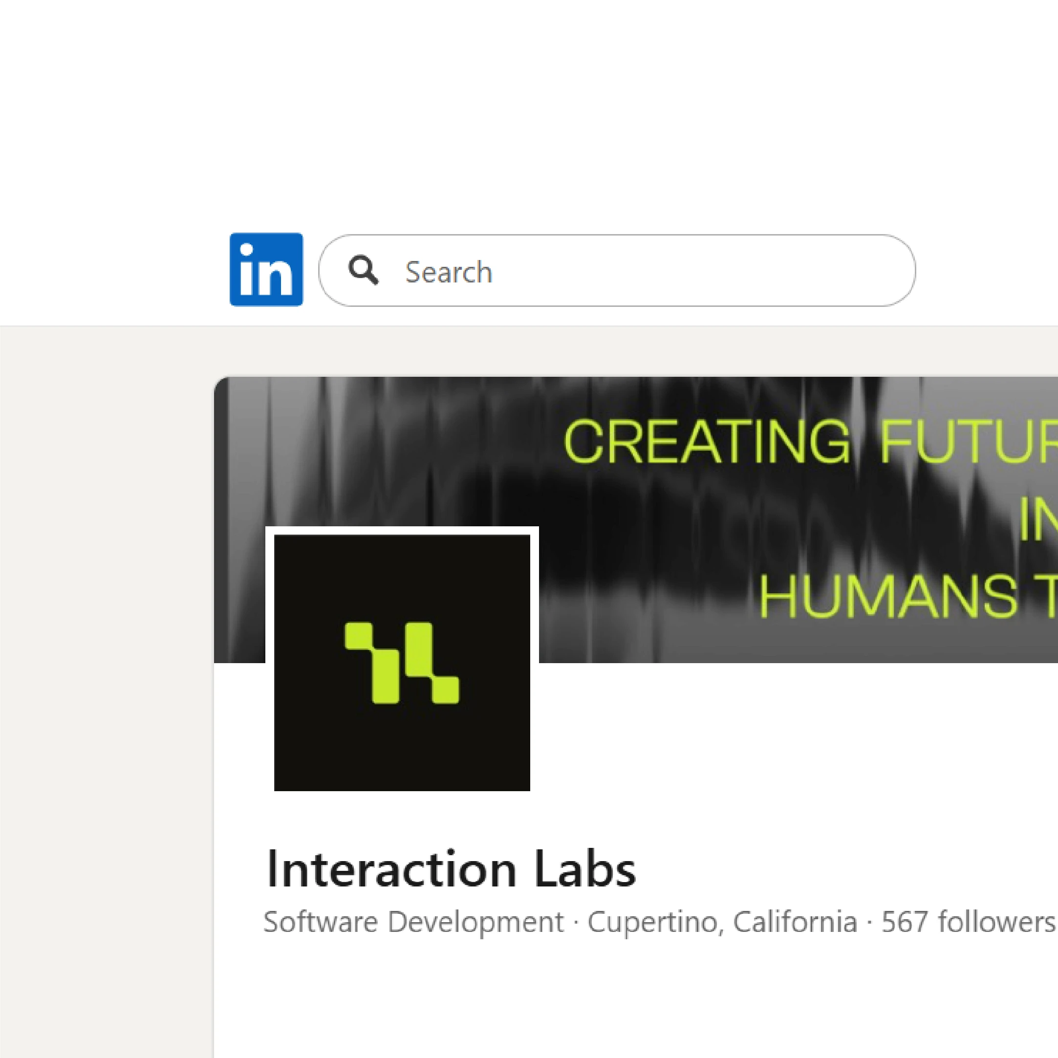
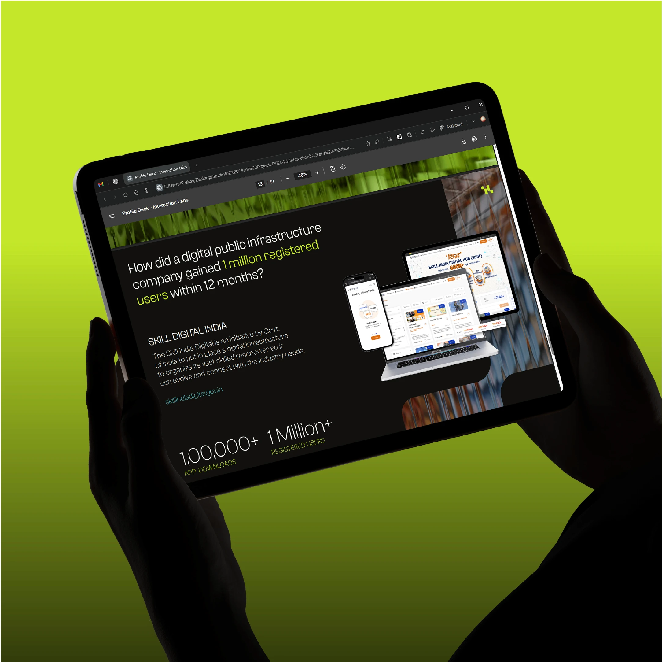
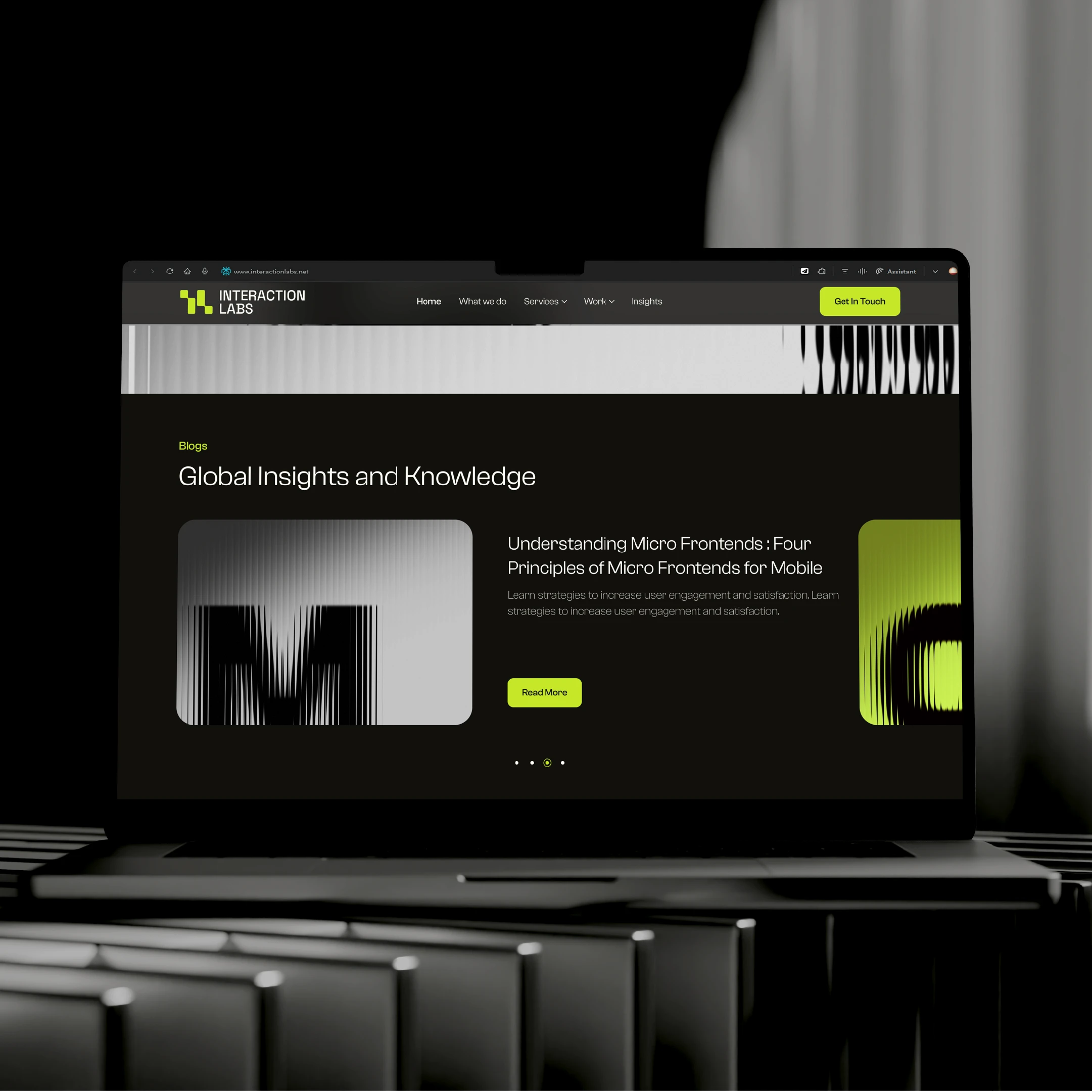
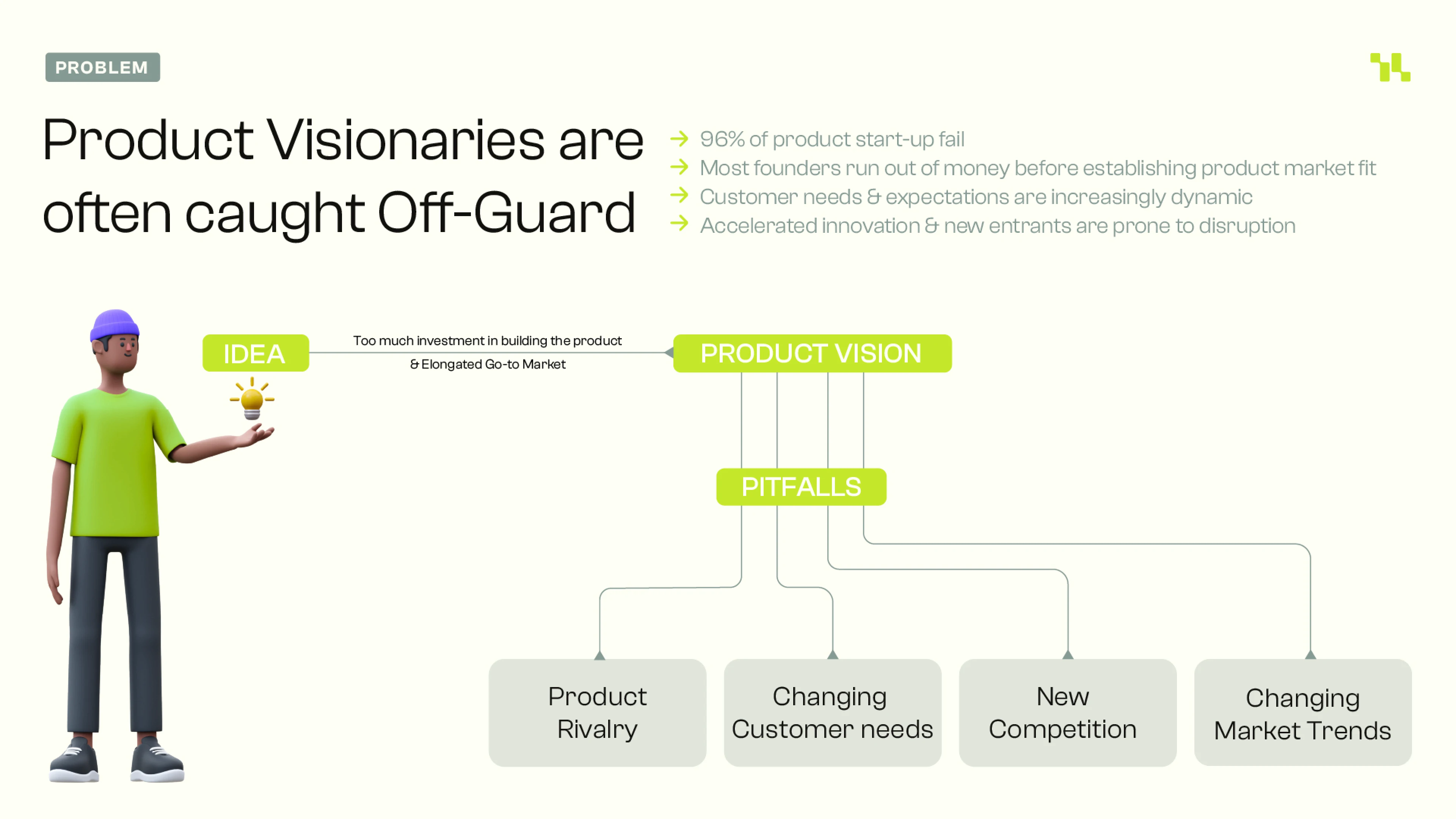
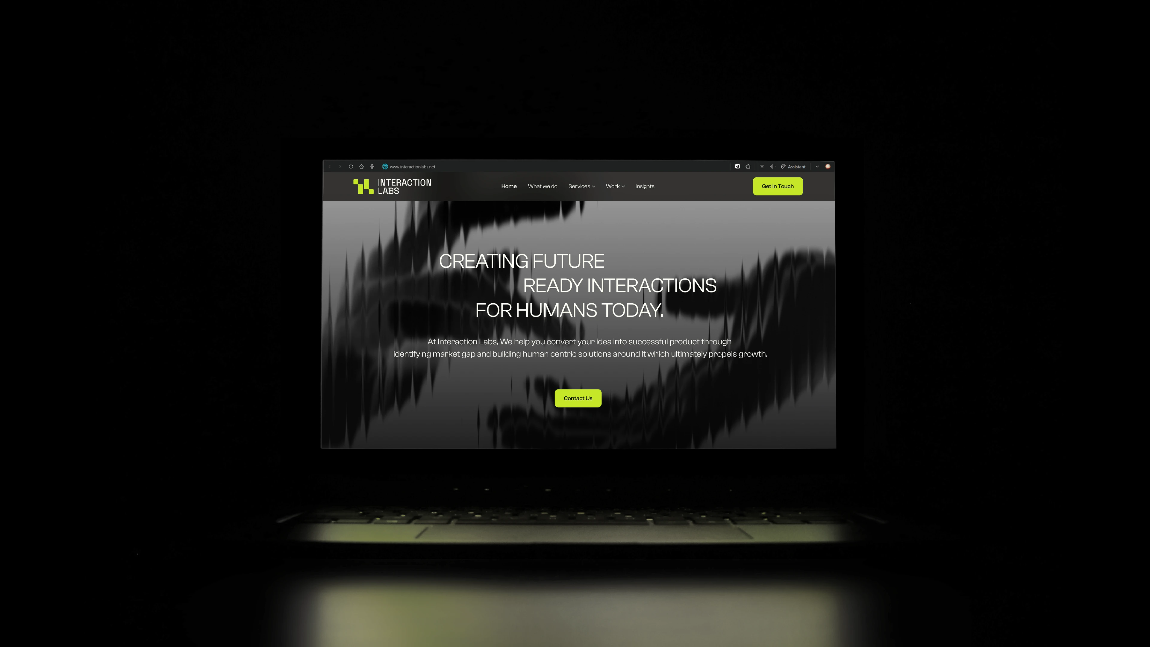
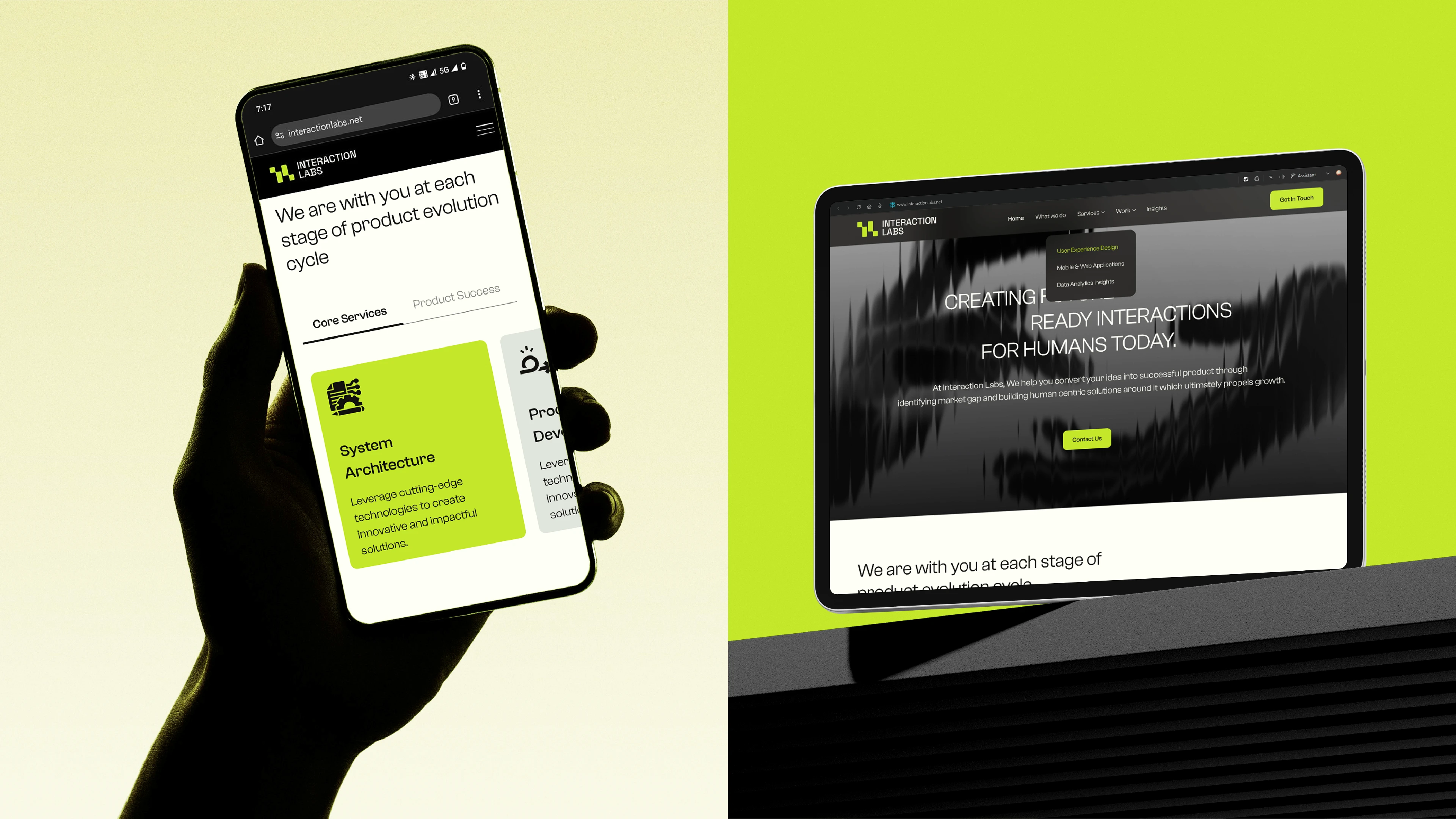
Working alongside Potent for content and insight, we rolled out the refreshed identity across the landing page, brand deck, and web experience, ensuring every asset felt unified and intentional.


Brand Guidelines:
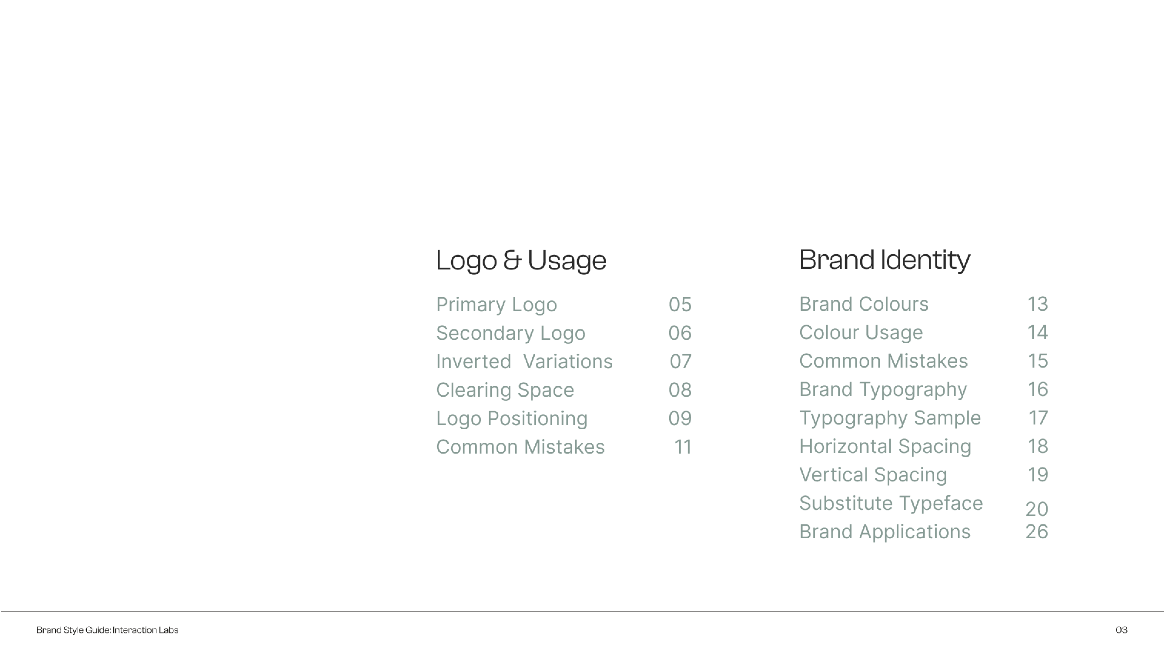
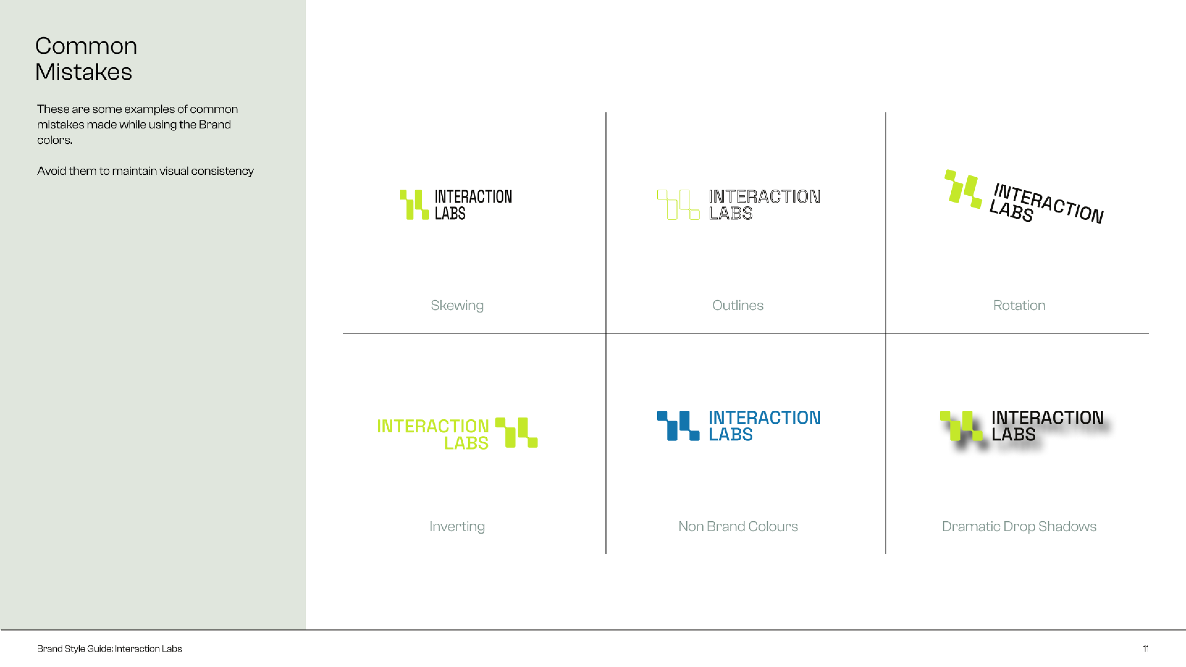
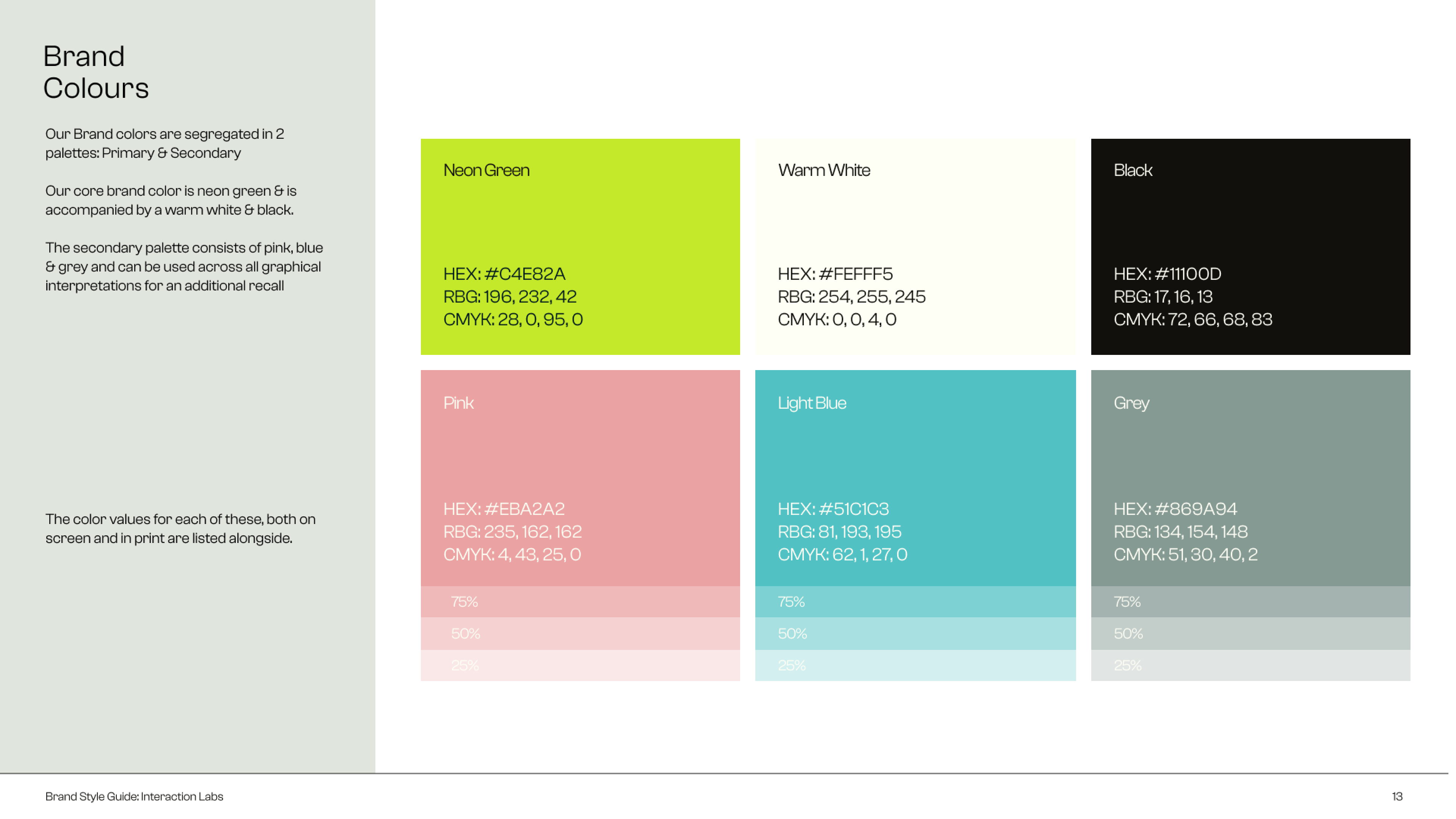
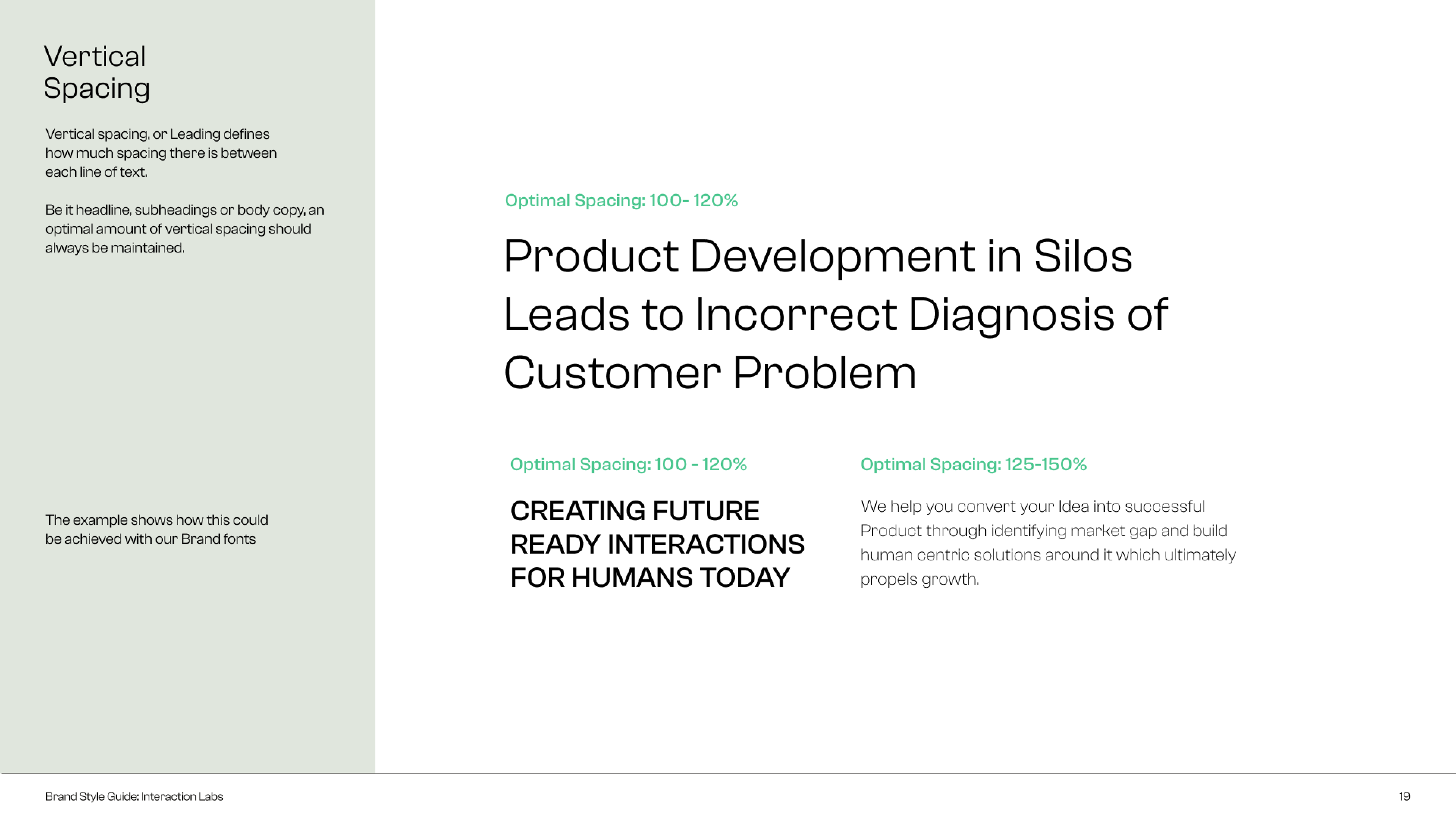
We compiled a detailed brand standards manual to maintain consistency across future applications, complete with final assets and usage instructions.



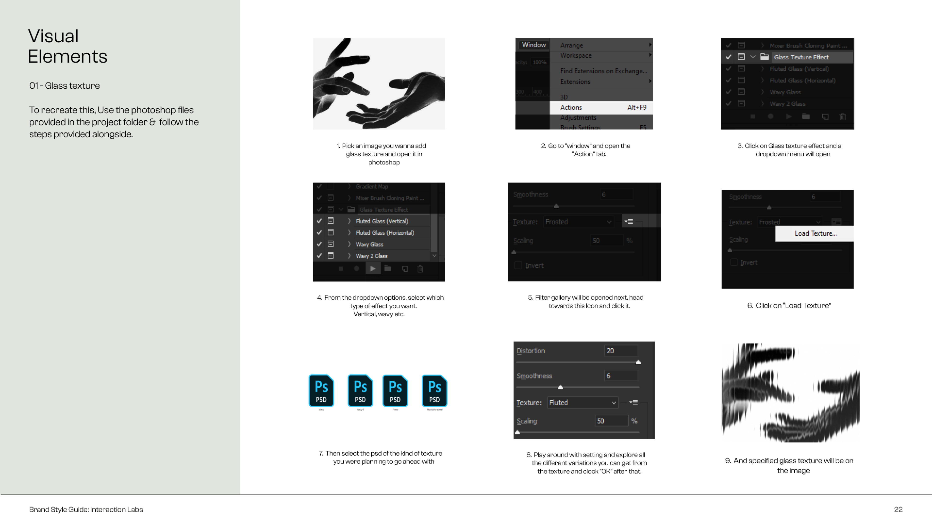
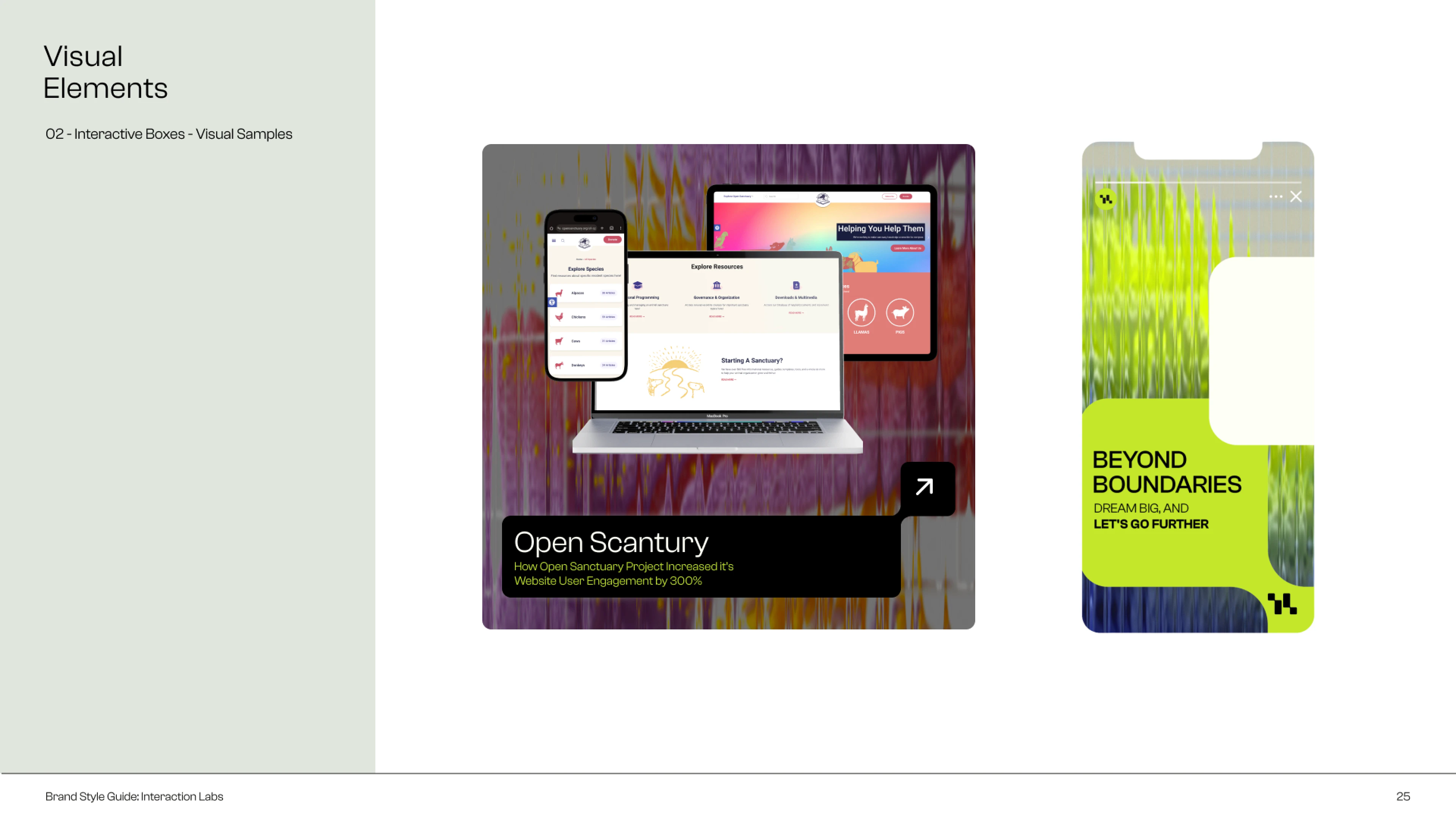
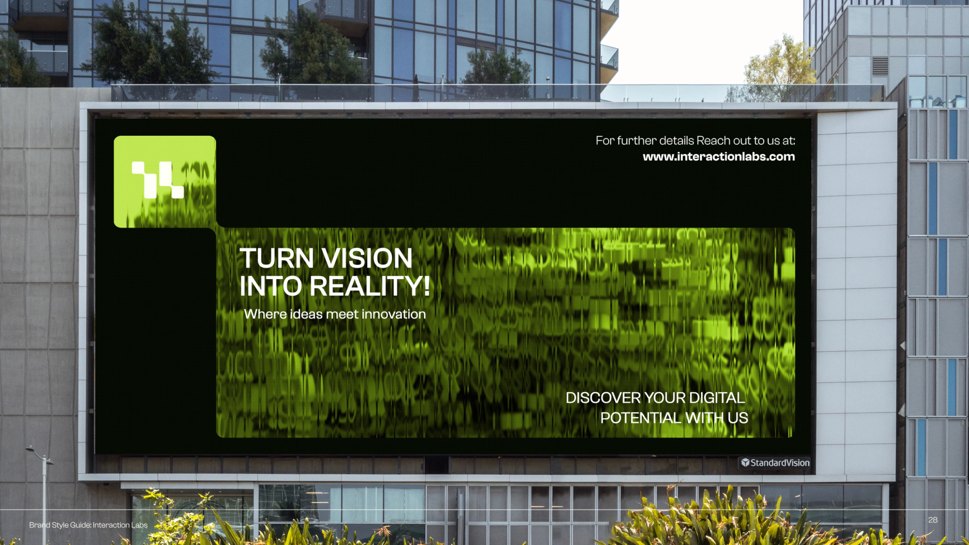
Impact: The new identity successfully bridges Interaction Labs' proven expertise with a bold, modern personality - earning trust, sparking conversations, and supporting scale.
At a Glance
The Whole Journey
Setting the Course
As we began setting the course for Interaction Labs, a product engineering studio that co-creates digital products by identifying market gaps, we faced a challenge.
Despite creating large-scale platforms like Skill India Digital (an initiative by the Government of India), the brand had no structured visual identity. Their logo was DIY, and the lack of cohesion was limiting trust and scale. Chirag, the founder, came to us with a clear intent: create a visual identity that looked and felt like Interaction Labs.
Concern: The absence of a strong brand presence was limiting trust and scalability. Could a rebrand shift the perception to match their experience and ambition?
Mapping The Journey
We began where we always do - with a structured process of discovery, direction, and design.
Discovery:
We conducted a deep dive into the brand: its customers, current perceptions, internal aspirations, and business goals.
This helped us define key variables that would go on to influence the brand’s personality and creative strategy.
Creative Strategy:
With these insights, we mapped the competitive landscape, built an ideal customer persona, and grounded the brand in a personality that reflected its core values.
For Interaction Labs, we leaned into the Sage archetype—an identity built on insight, clarity, and deep thinking.
Visual Direction:
We explored multiple creative routes in-line with both creative strategy and the founder’s preferences. Every visual choice was made in service of the brand’s newly defined core: interaction, intention, and growth.
Every visual choice was made in service of the brand’s newly defined core: interaction, intention, and growth.
Insights: What seemed like a visual design challenge turned out to be a deeper strategic problem. The brand’s perception simply didn’t reflect its depth, limiting how far it could grow.
Into the Expedition
For us, the logo is never the starting point of our journey. It is the ultimate blending of a larger story. And every story has a core concept.
At the heart of Interaction Labs, we charted their core concept - interaction between two sides. A founder and a team, a product and its user, a digital and human world. That became our guiding star.
From there, we crafted a logo after multiple iterations, and finally, one concept stood out. It was approved in the very first presentation, accompanied by a 5-minute monologue from Chirag about how seen he felt in the process. That mid-journey happiness.
Solution: A new visual identity that would reflect Interaction Labs' values and resonate with both internal teams and potential clients. More than a facelift, this was a reframe of how the brand showed up in the world.
The Touchdown
With the core concept in place, we expanded it into a full identity system.
Visual Identity System:
We extended the idea into a cohesive visual system, introducing “fluted glass” as a recurring design element to represent the blend of digital and organic through a human-centric lens.
We further expanded the logo into a system based on sections interacting with each other.
Digital Touchpoints:
Working alongside Potent for content and insight, we rolled out the refreshed identity across the landing page, brand deck, and web experience, ensuring every asset felt unified and intentional.
Brand Guidelines:
We compiled a detailed brand standards manual to maintain consistency across future applications, complete with final assets and usage instructions.
Impact: The new identity successfully bridges Interaction Labs' proven expertise with a bold, modern personality - earning trust, sparking conversations, and supporting scale.
At a Glance
The Whole Journey
Setting the Course
As we began setting the course for Interaction Labs, a product engineering studio that co-creates digital products by identifying market gaps, we faced a challenge.
Despite creating large-scale platforms like Skill India Digital (an initiative by the Government of India), the brand had no structured visual identity. Their logo was DIY, and the lack of cohesion was limiting trust and scale. Chirag, the founder, came to us with a clear intent: create a visual identity that looked and felt like Interaction Labs.
Concern: The absence of a strong brand presence was limiting trust and scalability. Could a rebrand shift the perception to match their experience and ambition?
Mapping The Journey
We began where we always do - with a structured process of discovery, direction, and design.
Discovery:
We conducted a deep dive into the brand: its customers, current perceptions, internal aspirations, and business goals.
This helped us define key variables that would go on to influence the brand’s personality and creative strategy.
Creative Strategy:
With these insights, we mapped the competitive landscape, built an ideal customer persona, and grounded the brand in a personality that reflected its core values.
For Interaction Labs, we leaned into the Sage archetype—an identity built on insight, clarity, and deep thinking.
Visual Direction:
We explored multiple creative routes in-line with both creative strategy and the founder’s preferences. Every visual choice was made in service of the brand’s newly defined core: interaction, intention, and growth.
Every visual choice was made in service of the brand’s newly defined core: interaction, intention, and growth.
Insights: What seemed like a visual design challenge turned out to be a deeper strategic problem. The brand’s perception simply didn’t reflect its depth, limiting how far it could grow.
Into the Expedition
For us, the logo is never the starting point of our journey. It is the ultimate blending of a larger story. And every story has a core concept.
At the heart of Interaction Labs, we charted their core concept - interaction between two sides. A founder and a team, a product and its user, a digital and human world. That became our guiding star.
From there, we crafted a logo after multiple iterations, and finally, one concept stood out. It was approved in the very first presentation, accompanied by a 5-minute monologue from Chirag about how seen he felt in the process. That mid-journey happiness.
Solution: A new visual identity that would reflect Interaction Labs' values and resonate with both internal teams and potential clients. More than a facelift, this was a reframe of how the brand showed up in the world.
The Touchdown
With the core concept in place, we expanded it into a full identity system.
Visual Identity System:
We extended the idea into a cohesive visual system, introducing “fluted glass” as a recurring design element to represent the blend of digital and organic through a human-centric lens.
We further expanded the logo into a system based on sections interacting with each other.
Digital Touchpoints:
Working alongside Potent for content and insight, we rolled out the refreshed identity across the landing page, brand deck, and web experience, ensuring every asset felt unified and intentional.
Brand Guidelines:
We compiled a detailed brand standards manual to maintain consistency across future applications, complete with final assets and usage instructions.
Impact: The new identity successfully bridges Interaction Labs' proven expertise with a bold, modern personality - earning trust, sparking conversations, and supporting scale.
At a Glance
The Whole Journey
Setting the Course
As we began setting the course for Interaction Labs, a product engineering studio that co-creates digital products by identifying market gaps, we faced a challenge.
Despite creating large-scale platforms like Skill India Digital (an initiative by the Government of India), the brand had no structured visual identity. Their logo was DIY, and the lack of cohesion was limiting trust and scale. Chirag, the founder, came to us with a clear intent: create a visual identity that looked and felt like Interaction Labs.
Concern: The absence of a strong brand presence was limiting trust and scalability. Could a rebrand shift the perception to match their experience and ambition?
Mapping The Journey
We began where we always do - with a structured process of discovery, direction, and design.
Discovery:
We conducted a deep dive into the brand: its customers, current perceptions, internal aspirations, and business goals.
This helped us define key variables that would go on to influence the brand’s personality and creative strategy.
Creative Strategy:
With these insights, we mapped the competitive landscape, built an ideal customer persona, and grounded the brand in a personality that reflected its core values.
For Interaction Labs, we leaned into the Sage archetype—an identity built on insight, clarity, and deep thinking.
Visual Direction:
We explored multiple creative routes in-line with both creative strategy and the founder’s preferences. Every visual choice was made in service of the brand’s newly defined core: interaction, intention, and growth.
Every visual choice was made in service of the brand’s newly defined core: interaction, intention, and growth.
Insights: What seemed like a visual design challenge turned out to be a deeper strategic problem. The brand’s perception simply didn’t reflect its depth, limiting how far it could grow.
Into the Expedition
For us, the logo is never the starting point of our journey. It is the ultimate blending of a larger story. And every story has a core concept.
At the heart of Interaction Labs, we charted their core concept - interaction between two sides. A founder and a team, a product and its user, a digital and human world. That became our guiding star.
From there, we crafted a logo after multiple iterations, and finally, one concept stood out. It was approved in the very first presentation, accompanied by a 5-minute monologue from Chirag about how seen he felt in the process. That mid-journey happiness.
Solution: A new visual identity that would reflect Interaction Labs' values and resonate with both internal teams and potential clients. More than a facelift, this was a reframe of how the brand showed up in the world.
The Touchdown
With the core concept in place, we expanded it into a full identity system.
Visual Identity System:
We extended the idea into a cohesive visual system, introducing “fluted glass” as a recurring design element to represent the blend of digital and organic through a human-centric lens.
We further expanded the logo into a system based on sections interacting with each other.
Digital Touchpoints:
Working alongside Potent for content and insight, we rolled out the refreshed identity across the landing page, brand deck, and web experience, ensuring every asset felt unified and intentional.
Brand Guidelines:
We compiled a detailed brand standards manual to maintain consistency across future applications, complete with final assets and usage instructions.
Impact: The new identity successfully bridges Interaction Labs' proven expertise with a bold, modern personality - earning trust, sparking conversations, and supporting scale.
Chirag Jobanputra
Founder, Interaction Labs
I absolutely love the new rebrand. It just feels like the brand we’ve always wanted to represent ourselves to the world. I would highly recommend Keshav and team to anyone who is planning for a complete rebranding exercise.
Want to strategically tailor your
B2B tech brand’s perception and
reduce sales cycle?
Want to strategically tailor your B2B tech brand’s
perception and reduce sales cycle?
Want to strategically tailor your B2B tech brand’s perception and reduce sales cycle?


Book A Free Call
Want Us to Chart Your Galactic Course?
Schedule a voyage and prepare for lift off in T minus 10…9…8…
Book A Free Call
Want Us to Chart Your Galactic Course?
Schedule a voyage and prepare for lift off in T minus 10…9…8…
Book A Free Call
Want Us to Chart Your Galactic Course?
Schedule a voyage and prepare for lift off in T minus 10…9…8…